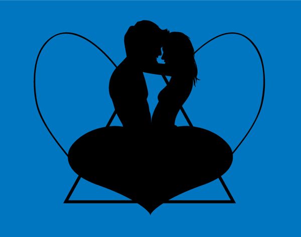
WIP image 1, a straight representation of sketch 2. Using roughly drawn angel ones instead of butterfly wings to see what it looks like, was supposed to represent cupid's angel wings. Looks very flat at this stage.
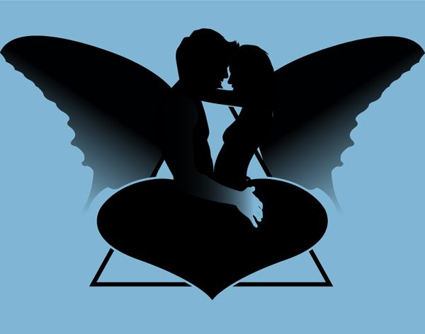
WIP image 2, i toned down the blue a bit so the illustration stuck out more then added actual butterfly wings. Also added a cheeky gradient to the guys hand to kill the flatness. Overall the image is a little dull.

No comments:
Post a Comment