Saturday, June 07, 2008

Exhibition

So we have finally reached the end with the third year exhibition show. There was a lack of updates on my blog site during May due to me being so busy getting all my work completed and writing up my learning agreement, but its all finished now! The exhibition launched last night and was a great success with many people showing up and enjoying the massive variety of amazing work created throught the schools of art here at Leeds Metropolitan University.

Heres my work which was there at the exhibition, you may recognise it from my earlier posts (with minor alterations). If anyone is intersted in seeing this in person, or seeing any other work produced from my course and all the other schools of art then come on down to the Civic Quarter at Leeds Metropolitan University, 'H' Block. The Graphic Design exhibition is held on the 8th and 9th floor and the entire exhibition will be running for another week from now.


More fashion vectors

A series of fashion vector sketches i did using different expermentations in each one to achieve different looks and feels.


Using lined areas to show shadow and selective exclusion of details in favour of suggestion.


Again experimentations with exclusion but usign a different order of colour to give a different feel.


A more abstract method of showing shadow, using an inverted colour scheme with highlights of symbolic icons.


Trying out the lines. I think it looks a little out of place with the rest of my work, but i will try to find a way to incorporate lines and make it look right.


This is one of the last sketches i did and is a stylistic approach i have used throughout my work.

Ring Girl


This illustration is for the cover of my learning agreement and also serves as an introduction to the whole 'The Match Up' series of illustrations.

Shape vs Line


These illustrations are designed to go with this piece of text "Drop beats not bombs". Whilst i like this first illustration, it doesn't really convey the message too well as its more like leaving a trail. There was much experimentation with line drawing behind the scenes here and found quite a few useful functions which ill doubt use in future illustrations.


This is the final illustration, which i think is a much stronger image. It was great going back to a level of abstract shape and completely flattening the image.

Analogue vs Digital


Analogue vs digital was an interesting one to do, i began by looking at robots within the industry and how they replaced human jobs. This lead me to find actual robot mimicing a human and also a robot dog which have both been created in the real world. The subjects in the illustration to give the sense of aggresion.


A minor edit here, the 'analogue' subjects were redone with analogue processes.

Monochrome vs Full Colour


The idea behind this piece was to show monochrome vs colour by using traditional fashion from opposite cultures with suits and gieshas. Several themes of opposites run throughout this piece. This is the giesha illustration i will use for the final piece.


This is the final illustration. Note that this is point where i started using transparencies into my work as both a stylistic tool and one to shade.

Monday, April 28, 2008

Week 7 v2


Final illustration of week 7 version 2. I like how this one turned out, and i feel the background really belongs in this image.

Much better than my first attempt i think!

Sunday, April 27, 2008

Gladiator


Again another character i will be using for the nbew week 7 illustration and this here is the gladiator who symbolises the extreme "macho" male. The idea is that he will be shot by one of cupids arrows and will now be hers. Lions head instead of human head for the extra macho-ness.

Cupid


Week 7 illustration has to be redone and heres one of the characters i will be using for the new illustration. I know cupid is meant to be male but this is my own take on it and sorta havea rouch plan of all the stuff i want to include in it. Not much to say about this but i am really happy with it.

Week 46


After much expermenitation, this is the final illustration i have come up with. Initiallly i had fire around the circumference of the sun but it looked really crap so i changed it for sun rays like in my original sketch. The sun rays are supposed to be abstract torches (the modern kind) but i'm not sure if that communicates well enough.. they do however serve their purpose as sun rays. Water details was added and more feminine detail was added to the character as i had read that lakshmi is also meant to be beautiful.

Week 46 WIP


Initial idea for the week 46 illustration, with the theme being diwali. I used I used a figure i would associate with indian religion and culture and put her sitting on a lotus flower as i had seen in some old depictions of the Hindu Goddess Lakshmi


This is a sketch showing ideas and composition. Diwali is the festival of light so i want include elements which would suggest light, such as fire, flames etc. Also using a reflection to create the 4 arms of Laksmhi and again I'm noticing the use of opposites in my work (water/fire). I seem to sub-consciously include a lot of opposites and contrasts in my work

Thursday, April 10, 2008

Week 7


Final image for Week 7 illustration. I changed quite a few parts, the butterfly elements were almost removed completely and made into a hair clip instead as i didn't want that idea to stand out as much. The triangle was changed into a circle as i think that represented love more (they actually both stood for love), and more love related symbols were added (the roses and doves) and finally more detail were added to the bodies in general to make them more masculine/feminine.

I was quite happy with the final image but it was too generic and obvious (which i agree with) so this will be redone.

Week 7 WIP


WIP image 1, a straight representation of sketch 2. Using roughly drawn angel ones instead of butterfly wings to see what it looks like, was supposed to represent cupid's angel wings. Looks very flat at this stage.


WIP image 2, i toned down the blue a bit so the illustration stuck out more then added actual butterfly wings. Also added a cheeky gradient to the guys hand to kill the flatness. Overall the image is a little dull.

Week 7 Sketches

These are a few sketches from the Calendar Brief. This particular illustration is for week 7 (February 9th 2009 - February 15th 2009). The rules are to use 2 pre-set colours depending on the month (Black and blue for February) and to choose a specific date to illustrate an event/season etc. I chose to work on Valentines day


First sketch using hearts and a couple to represent Valentines day. The butterfly wings are supposed to symbolise "butterflies in your stomach".


Another sketch but using a different couple this time. I wanted to use a couple standing as i intended to have the option of incorporating the actual butterflies into the stomach to make that particular message clearer

Wednesday, April 02, 2008

Background elements

So I've been using background elements in my recent illustrations and I've had a lot of trouble just thinking of what i can add to it without just creating clutter and the answer seems to be pretty simple - with a simple idea of semiotics and to keep the items relevant.

For example, if i want to show that something is outdoor then i could perhaps add a tree, grass, clouds for a example to fill the top half of the page. Mix this in with some more abstract shape relating to the topic and it starts to create something much more interesting yet still make sense and feel part of the illustration.

flat vs 3d


This is the Final illustration for the "flat vs 3d".

I wanted to use reflections to show the difference between 2d and 3d. I didn't really add much to version 2 but just tweaked a few of the details as adding more just seemed to clutter it, overall I'm happy with the outcome.

Flat vs 3d WIP


First WIP image, using the a reflection to show the idea of something vs another. I thought this was dieal for the illustration as i could use 3d models with 2d shadows.


2ns WIP image showing more detail in the background and also finer detail in the reflection. I intend to add more detail in the background and reflections

Monday, March 31, 2008

3d boxer


This is the 3d boxer i will be using for the flat vs 3d illustration. I added the highlight detail using shapes rather following the original image as i wanted to stray from photo realism.

Friday, March 28, 2008

Background and Foreground

I've been looking at a few images again, especially in relation of adding objects into background and foreground and have seem some interesting techniques that i want to play with.

Tonal colour: as i use a lot of black and white in my work, i can also use shades of grey. What i have found look really nice is to use different shades of grey to seperate objects and also to make them appear closer or further away. Then theres gradients which you can use to bring things back into the foreground and make things appear from another object.... all part of making a more seamless image rather than bunging stuff on top of each other.

Size: This one is a pretty obvious one, using size to my advantage to make things appear closer or further away, or of course exaggerating something to make it abstract or just to make it stand out more.

And finally what to put into your image. I think its important to make most if not all objects in an image relevent to the subject. But also adding slightly abstract geometric shapes can add to the feel of the image and also be using is background/foreground images to break something up.

Plenty of stuff to experiment with here!

Abstract vs Literal


Final illustration for Abstract vs Literal.

I used all the initial sketches for this image, there was actually many many versions which i havent shown just using different geometric shapes and colours and playing a lot with composition just see what works and what doesn't until i was finally happy with the image.

I do like how this image has turned out and i think elements such as the bee/butterflys work better when in the context of this illustration rather than on its own.

Theres still not enough going on in the background for my liking and thats a direction i want to steer into. It still looks a little sparse to me. I am however really happy with how the gradients turned out and it is a lot trickier than it looks!

Abstract vs literal WIP

Here's a few WIP images from the Abstract Vs Literal illustration


Another idea for an abstract boxer, this time using a dogs head to replace the boxers head. The dog is a "boxer" dog.. See what i did there? haha..

Anyway, i quite like this image think it works really well and fits in place.


So this here is an image for the literal boxer, i purposely left him quite plain as i intend to use him to fit into parrt of an illustration and want to experiemnt with joining objects together, using the mass of blacks i normally use as an advantage.


This here is a WIP image of how the illustration looked at one point. I intially just laid it out like this as it made sense at the time, and added a little bit of background.

Tuesday, March 18, 2008

Abstract Boxer WIP


Part of an illustration for the series of wrestling match ups i am doing. This particular one is absract vs literal, and using boxers for the 2 headings (yea theres a contradiction there already!)

So this is my take on an abstract boxer... though i think its kinda hard to see my idea when there is no colour. The idea was to illustration muhammad ali for the literal boxer, and using one his most famous quote to represent an abstract boxer:

"Float like a butterfly, sting like a bee."

Does it work?

How to Iron Outcomes


So heres all my outcomes so far for the how to iron brief, i can definitely see how i progressed throughout the brief.

I think the main point i learned here is to not be lazy with reference images, and to really push the idea across.

How to Iron experiment


Another mockup i did, just playing around with gradients to take away the flatness of the picture. Also interesting to add something to the skin again just seeing what i can do to take away from the flatness

Wednesday, March 12, 2008

How to iron v3


First version was this, without the wires drawn in.


I decided to add the wires in as i have done throughout all the versions. The unplugged reference is supposed to further communicate the idea of ironing the wrong way, as the irons would obviously not work if they are not plugged in.

Hopefully this attempt will make the grade

Sunday, March 09, 2008

Photo-realism

One thing I've been wondering about lately is why I do i draw what i see? I use reference images for the my illustrations i tend to reproduce what i see... with montage pretty much being the only process I use to change what is actually there. While it works for me right now, I think I'm holding back a little and perhaps being a little "safe" as i am still getting the grips for the software, and a whole load of other excuses but the point is I should really push this forward.

One thing I have stated is that i never really wanted make my illustrations too literal and that is partly my own fault. I do a lot of work in monochrome or at least with very minimal colours, with huge areas of black to cover detail I don't want to show (and also being a general aesthetic quality I like) , and I've been thinking that I could really use this as an advantage. With so much black space and area, I could quite easily manipulate one illustration blending into another. Why should I illustration a whole person when I could quite easily draw the top half of that person to get the same message across? I've mentioned I like pattern and shape and they are all elements I could incorporate into my illustrations to make them that much more interesting and unique but still within reason and of course being appropriate.

The Peacock and the Crane (Reworked 2)


This is the reworked version of the middle image. I replaced the head for an actual crane head as it communicates better than the original, but still gets across the idea of an angel and a crane.


This illustration is for the final section of the fable, nothing much to say about this really, had to apply the clothing seen in the first image onto the reference image for this illustration, so it doesnt look as good as it could i don't think but the overall idea and feel is there.

Thursday, February 28, 2008

The Peacock and the Crane (Reworked)

I did some alterations to the Aesop''s Fables images. I decided to black out the face for the beginning image to try and make the king more anonymous, and also to put more emphasis on the detail on his clothing and tail. It still has too much connection to Henry VIII i think and I am thinking of replacing his head altogether for an actual peacocks head, and perhaps have a peacocks body and putting king like clothing on it.


I blacked out the wings on the middle image so that it was more in l,ine with the beginning image and also because it simply looked better on the white background (which i have no control over as its part of the brief). The head of the angel may be replaced by a cranes head as it may communicate better.

Final image is still to come, and more reworked images to follow.

The Peacock and the Crane

The beginning and middle parts for Aesop's Fable Brief - The Peacock and the crane.

A peacock spreading its gorgeous tail mocked a crane that passed by, ridiculing the ashen hue of its plumage and saying:
"I am robed, like a king, in gold and purple and all the colours of the rainbow; while you have not a bit of colour on your wings."
"True," Replied the crane;
"But i soar to the heights of heaven and lift my voice up to the stars, while you walk below, like a cock, among the birds of the dunghill."

Fine feathers don't make fine birds.


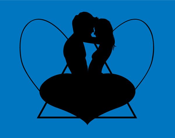
The beginning image for the fable. I chose the use a king to represent the peacock as a king is a character that dresses and appears to "great" but may not be all that special. There is also a reference in the fable where the peacock says that he is robed, like a king.

The tail took me quite a while to do, but it got finished in the end. I was criticized for using Henry VIII as the king as it has too many strong links to him rather than a generic king image i am trying to promote, which i really agree with.


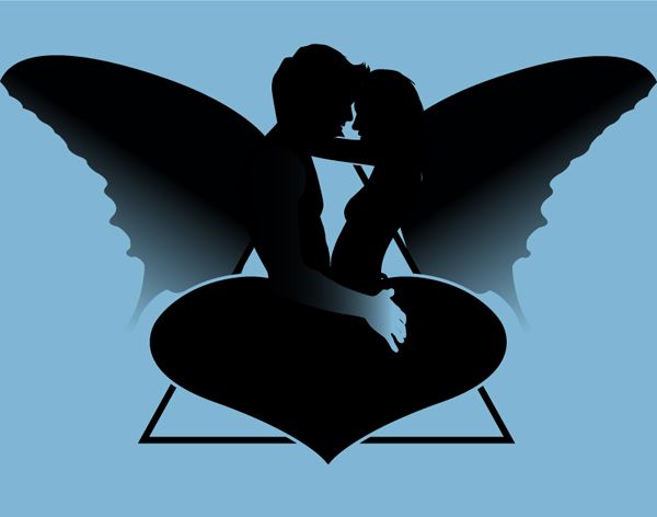
This is the middle image. I used an angel to represent the crane, as an angel is someone i've seen (in stories and pictures!) and expect to be pretty dressed down in simple garments, much like a monk or something like that... only with wings. There is also a reference in the story where the crane says it can soar to the heights of heaven.

I've been thinking that the heads of both pictures could be replaced by the corresponding bird heads to make them anonymous, something to think about.

The final image for the fable is yet to be done.

Tuesday, February 26, 2008

A New Leaf

So after a good talking to, i have decided this blog will now contain much more of my work and be more of a log of everything i do from thoughts all the way to final outcomes instead of its current format which is just shows pieces

I got my formative assessment back today and it had some good info about what i needed to improve, especially with regards to my learning agreement.

I;ve got to concentrate much more on my research and references, and really look into the opposites theme, something that i have always been interested. Some comparissons to note:

Abstract vs. Literal
Flat vs. 3D
Monochrome vs. Full Colour
Digital vs. Analogue
Style vs. Content
Shape vs. Line
Detailed vs. Suggested

My personal favourite being style vs. content. I have been struggling to find the correct balance for this and at the moment my work is very much concentrated on the content, whilst previous years was all about style... so with some hard work i will hopefully be able to strike the perfect balance.

A phrase a coined up was me trying to wrestle with stlye vs. content, and then a joke was made about an actual wrestling match... now it seems like a good idea to use a wrestling match as a theme for my learning agreement! I had previously been looking into mexican wrestlers, well actually it was more about vintage posters during a period when i was really interested into vintage design. You see how i like opposites? jumping from vintage to vectors?

So just something to think about really... perhaps a book or something, like a programme to be handed out!

How to Iron v2


This is my second outcome of the Guy Browning "How to Iron" brief. I am much happier with this illustration because communicates better about how not to iron.

This however was rejected again so v3 to come soon!

Thursday, February 07, 2008

How to Iron


Illustration for the Guy Browning brief. The illustration is for an article titled "How to Iron".

I think i should have used a better reference pictures because some of the angles dont look quite right.

Sunday, February 03, 2008

Who Needs Nine Lives?


An illustration for the New Scientist brief, to illustrate the text given in an article titled "Who needs nine lives?"

I had originally had some background elements into the image but i thought they just made it a little cluttered.

Monday, January 21, 2008

The Waiting Room


My final design for the waiting room brief which was to create a public information poster.

My eyes were dead after doing this haha!

Wednesday, January 09, 2008

Tear Down This Wall


An unusual piece from me here, a typographic interpretation of a political speech. I choose Ronald Reagan's speech challenging Mikhail Gorbachev to destroy the Berlin Wall to bring freedom and peace to Eastern Europe.

The speech can be seen here (1:00 - 2:00 was the exact part i used)

I quite liked this actually and it turned out to be more relevant to my work than i realised. Whilst i didn't actually draw anything, i was forced to focus on symbolism and how small differences in size, style, space can affect a piece. Certainly all stuff which can be applied to my normal practice.